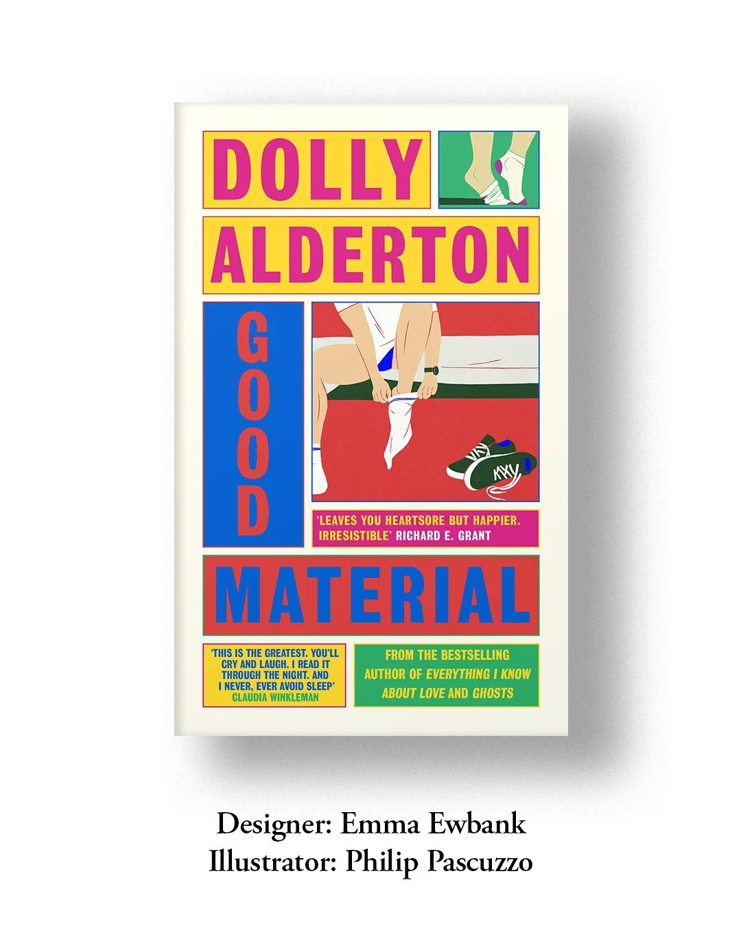
In Grids & Panels
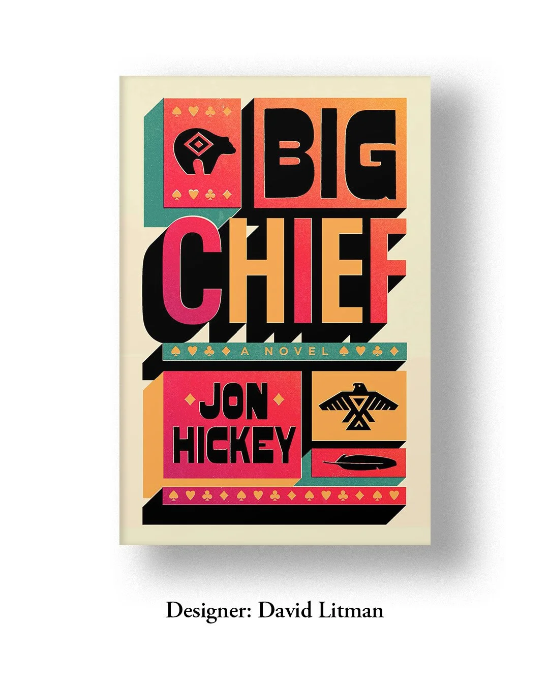
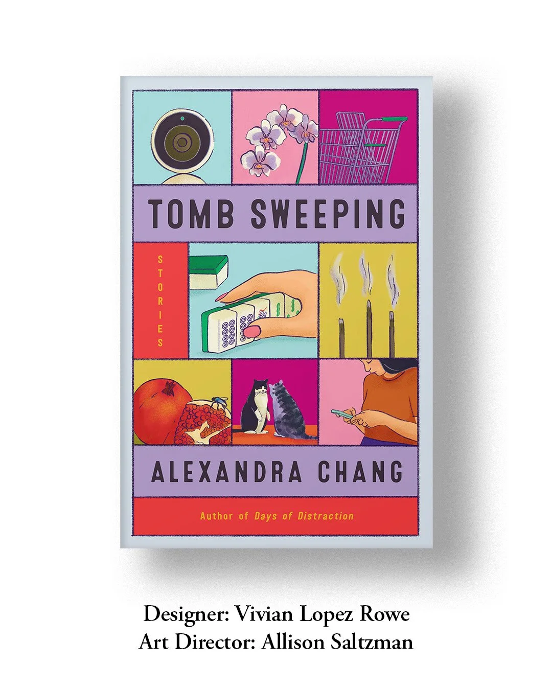
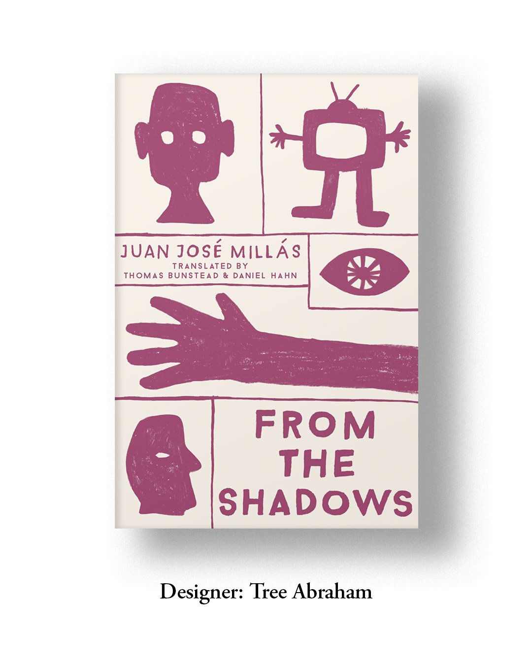
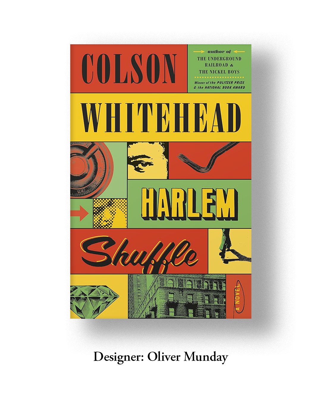
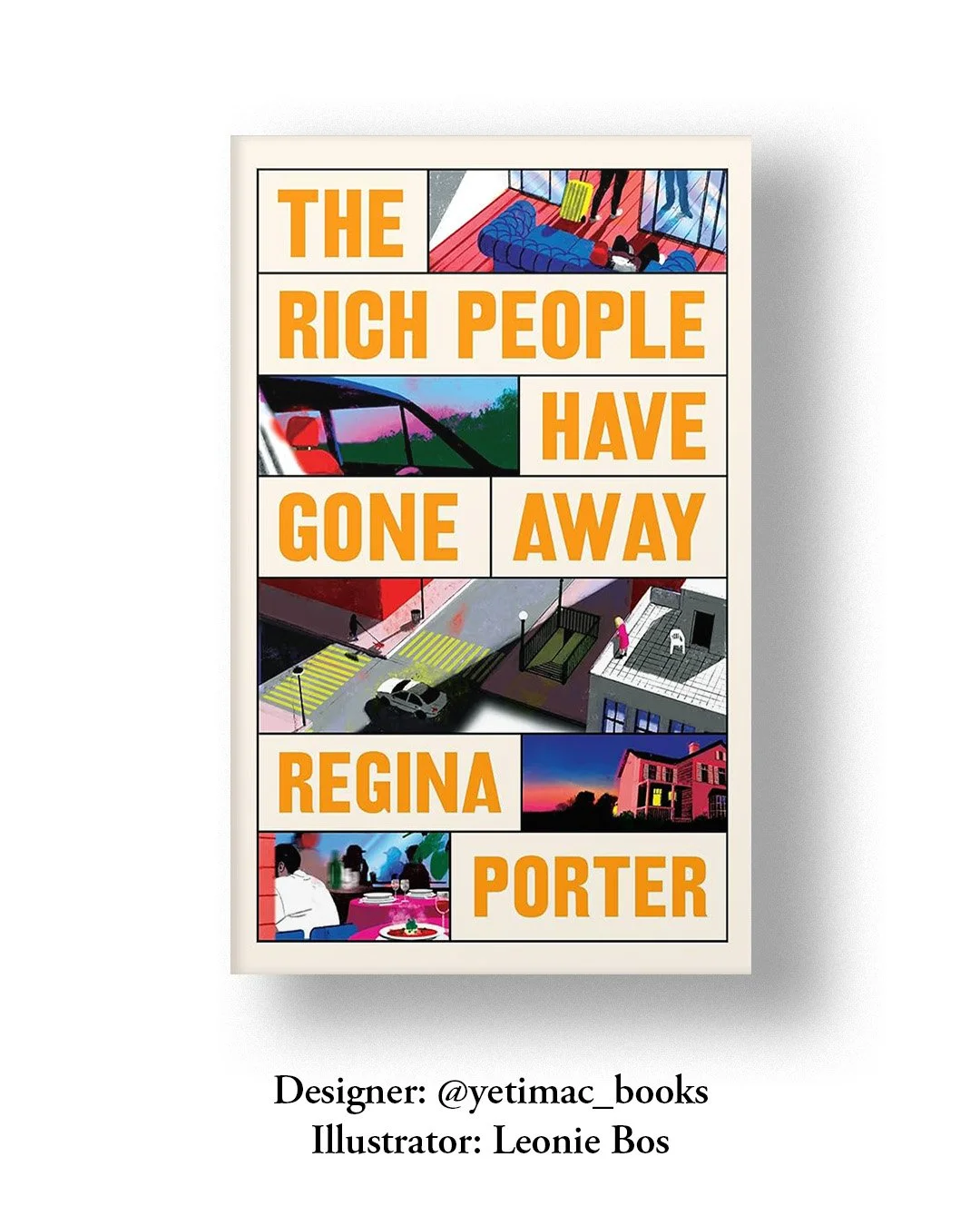
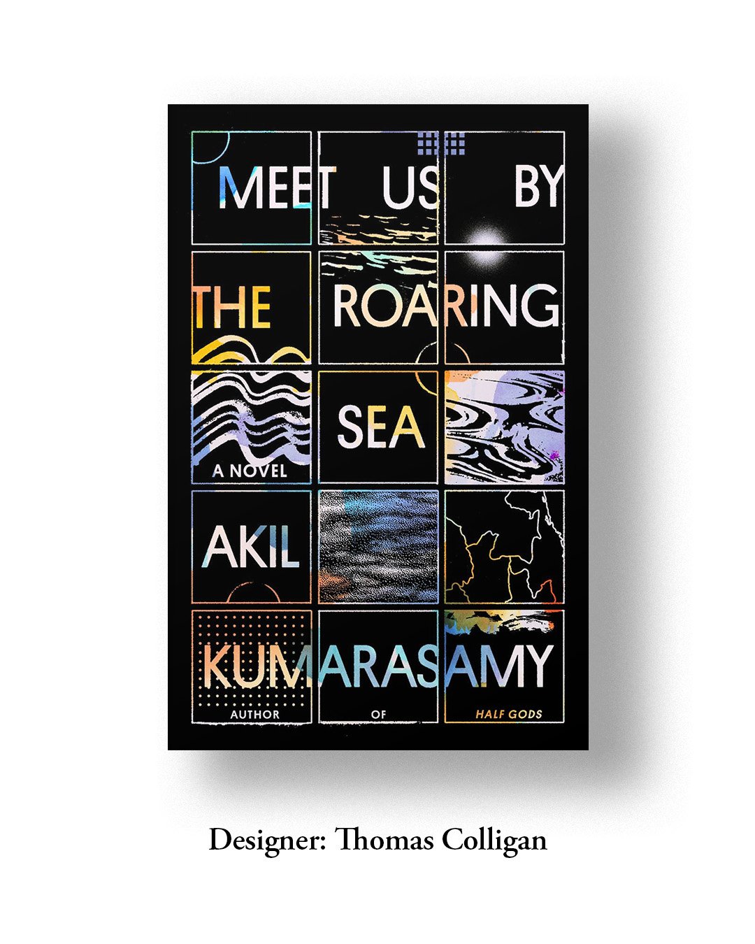
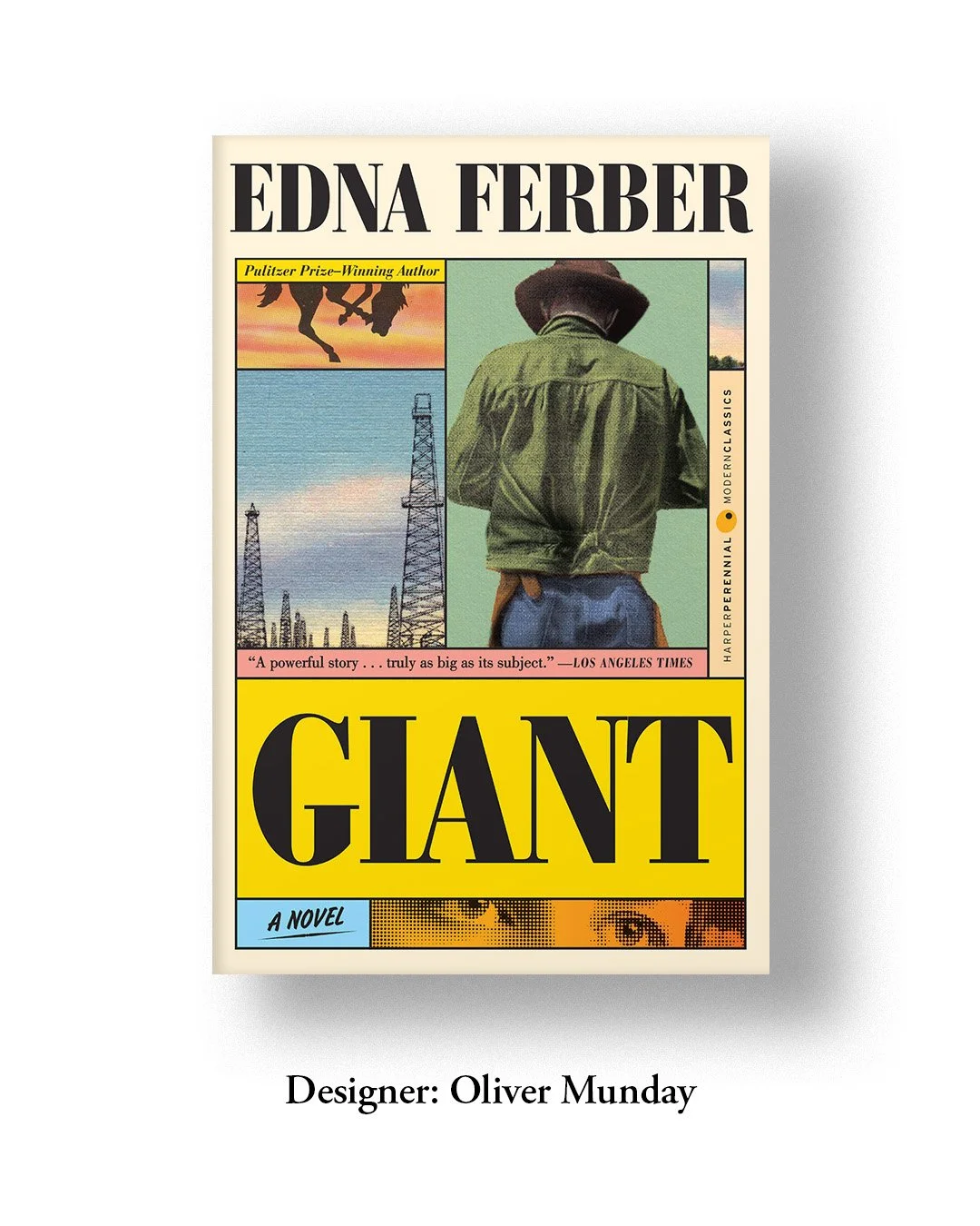
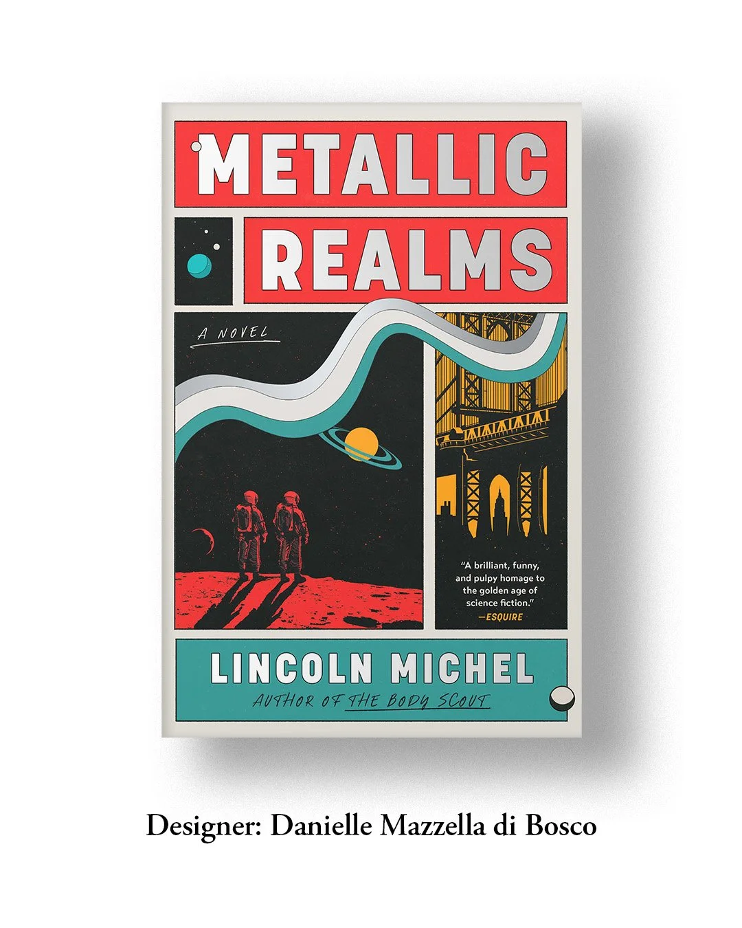
Every time I come across a cover with multi-panelled illustrations in varied grids, the visual of an endlessly moving Grid block comes to mind. There’s a great deal of versatility in how one can modify the grid. What particularly interests me is the creative ways in which designers are using grids and panels to block images & create blank spaces, and explore the relationship between typography & visuals.
Hence, the grouping here is not limited to the conventional flat panels. A rather direct way to highlight key themes, plot twists, and easter eggs, these covers, if not resembling, might proudly have taken inspiration from the comic strip, pop-art, or graphic novels. It is quite interesting to note the subtlety it holds in reflecting the retro design elements, either in colour choices, typeface, or imagery.
So what really tempts designers to adopt and reinvent this style? I do not hold any authority in sharing strong opinions or making statements, but I am still figuring out my liking for it.
And if you have made it this far, I would love to know your thoughts on this.
P.S. Fun fact (if it’s news to you)- Rodolphe Töpffer, a Swiss artist and author, is credited for creating the first multi-panel comic in 1827.
