Brisk, braver, boldest
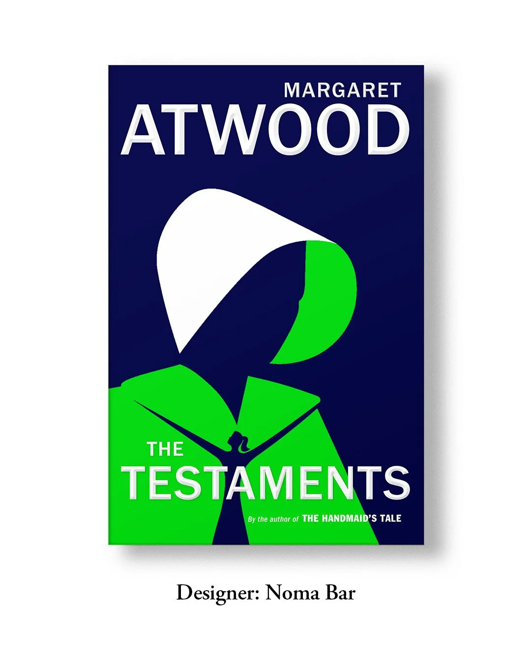
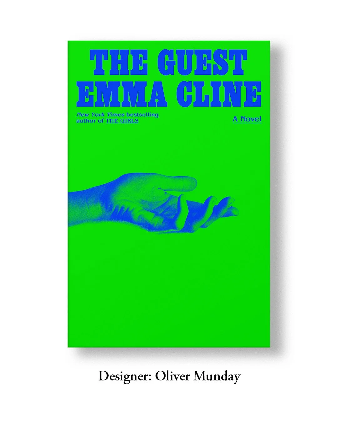
Following Pantone’s announcement of Greenery as their 2017 Colour of the Year, green has been recently celebrated across architecture, interiors, fashion, beauty, and food, while also gaining huge popularity on book covers. My very first memory of it was on The Testaments by Margaret Atwood. And the more I browsed, all that popped up were greens. Not just any green; the one that casually belongs to the family of electric, neon, vivid, luminous tones.
Often highlighted by typography on thriller & mystery novels, this digital green (as Jane Boddy, Trend Forecaster at Pantone Colour Institute calls it) digital green has become quite a ubiquitous & fearless backdrop for the covers of literary fiction. A hue that was once a synonym for everything lurid and gaudy now demands a bold, rather celebratory attention. While we love its lavish digital presence for the merit of its vibrancy, I have always enjoyed the beautiful and charming experiments in print. It is as if the acidic quality is muted by a fresh revival.
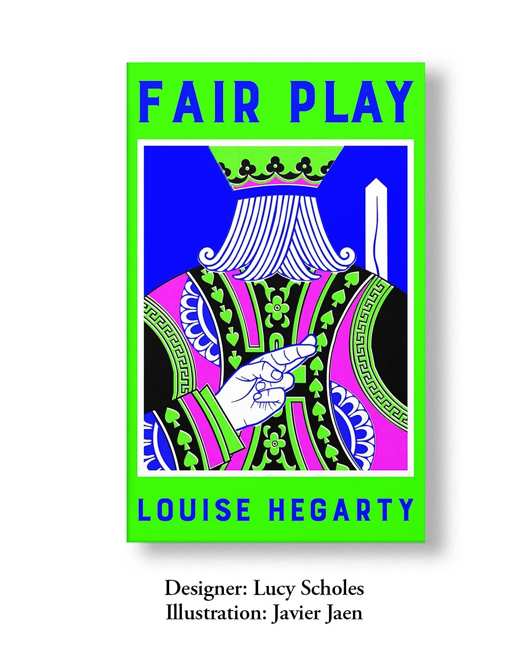

“While subverting something familiar (the playing cards) to make it more contemporary, I wanted the four Pantones to balance each other really well - the most finishes to ever get on a cover” - LUCY SCHOLES
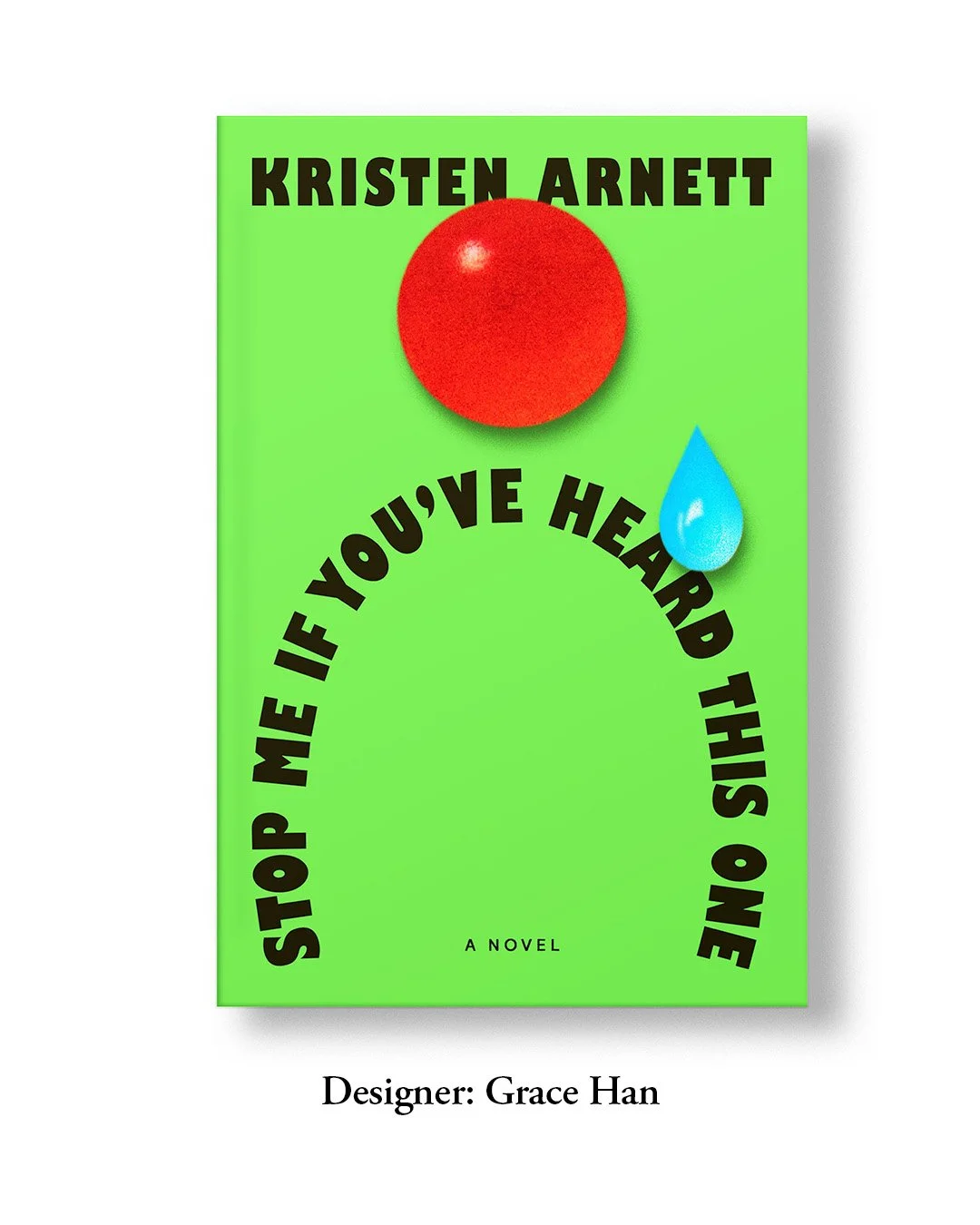
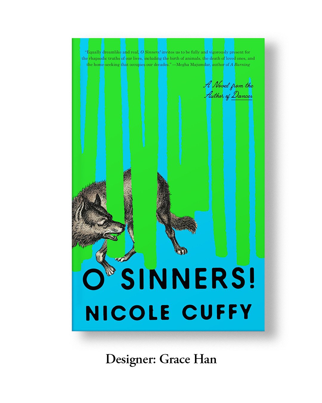
“I love how green brings life and vivacity to a cover. I like the energy it conveys” - GRACE HAN
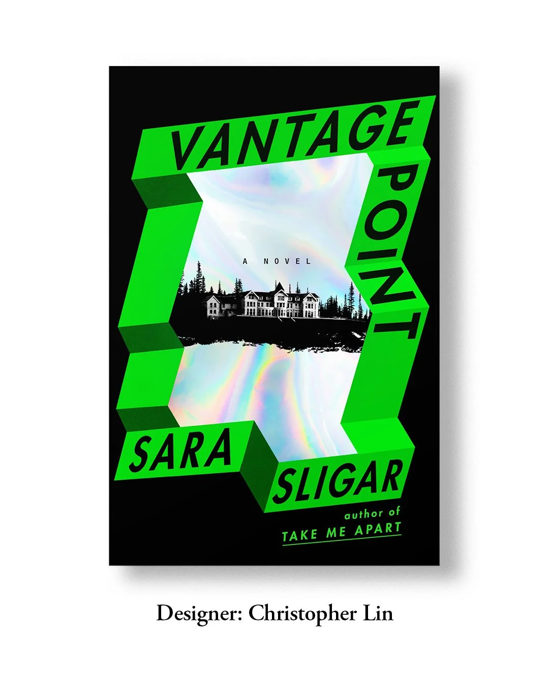
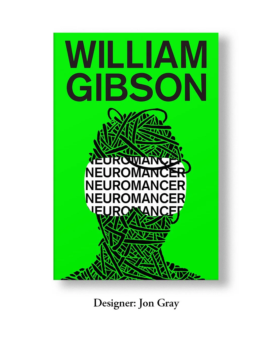
“I chose this green as a framework to signal the technological suspense of the novel. I love that green is having a resurgence on book covers. It is such a versatile color that can evoke a range of feelings and sensations from a light summery breeze to intense psychological dread.” - CHRISTOPHER LIN