Polkas & Peeping Punches
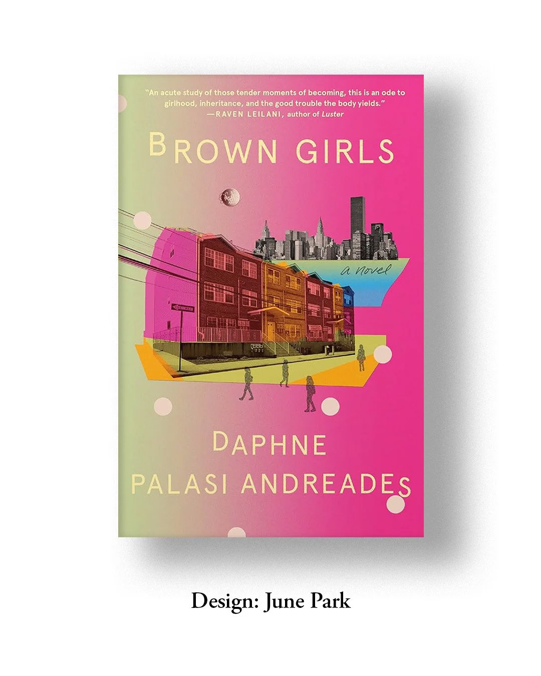
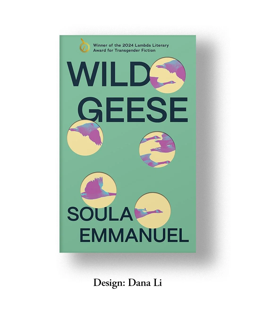
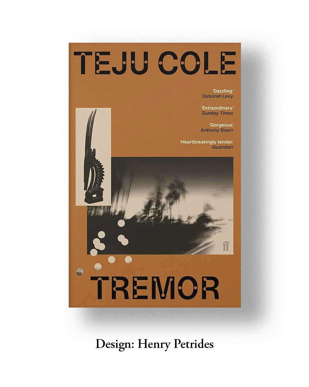
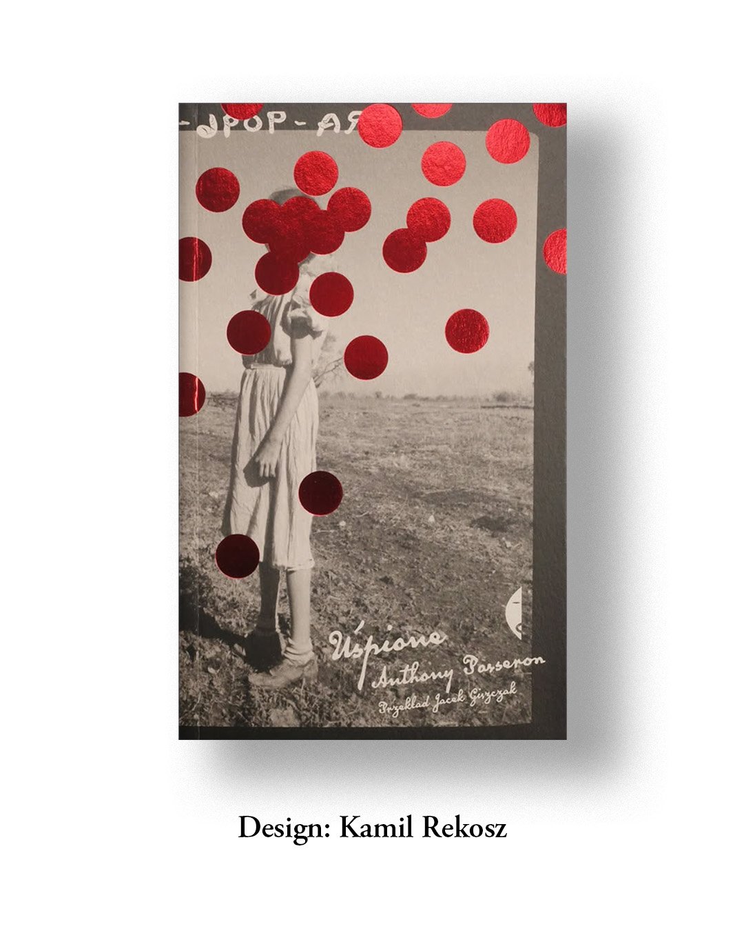
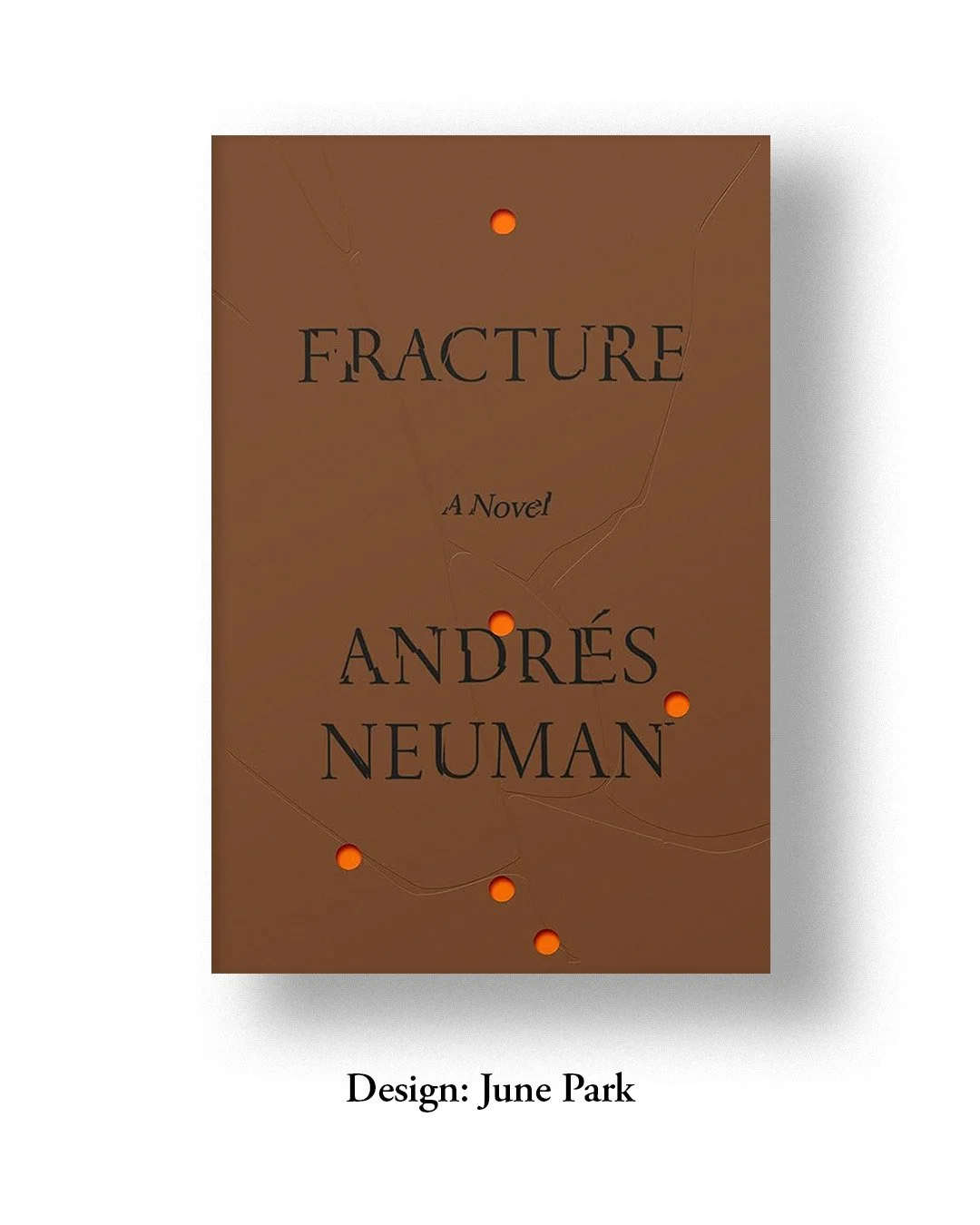
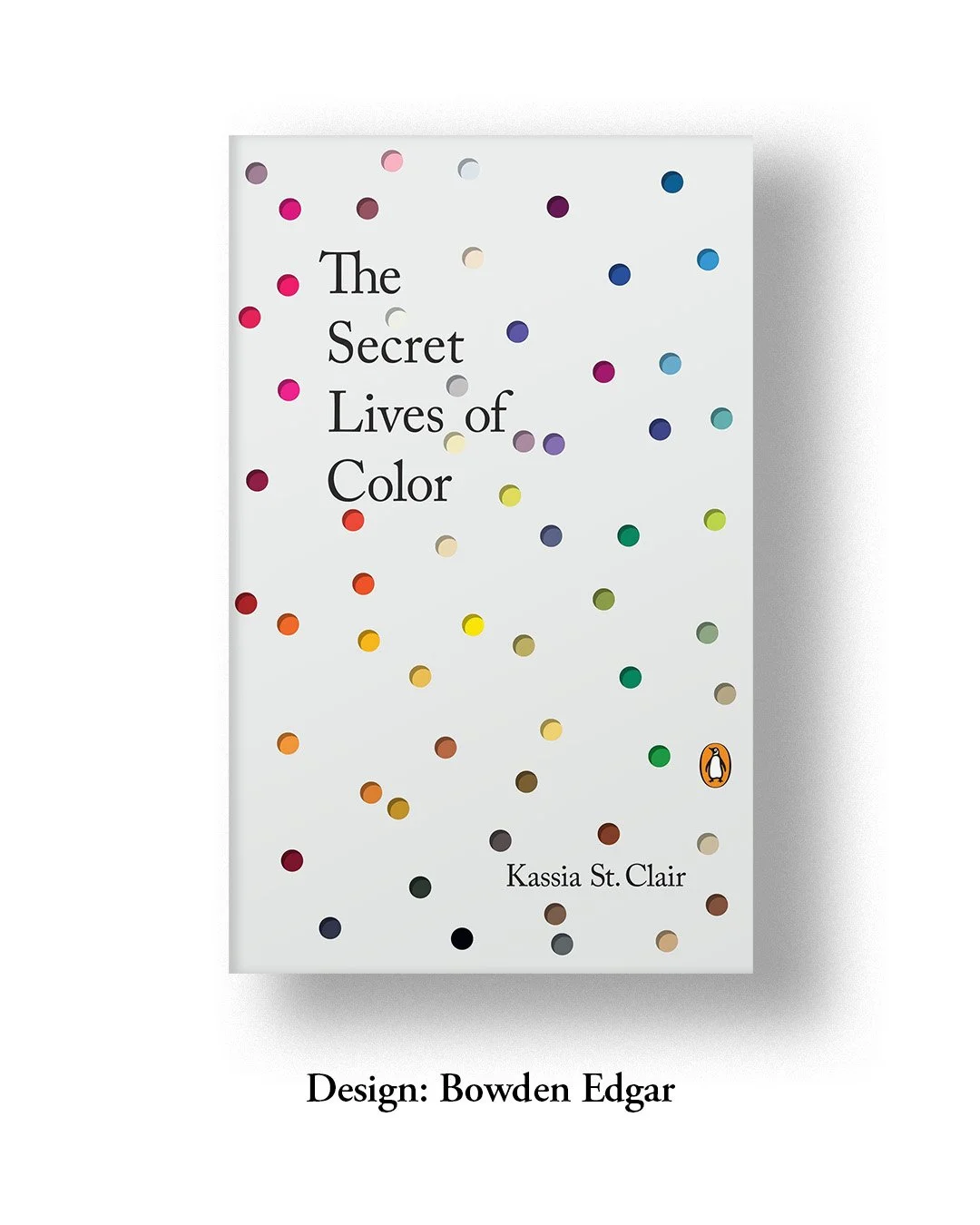
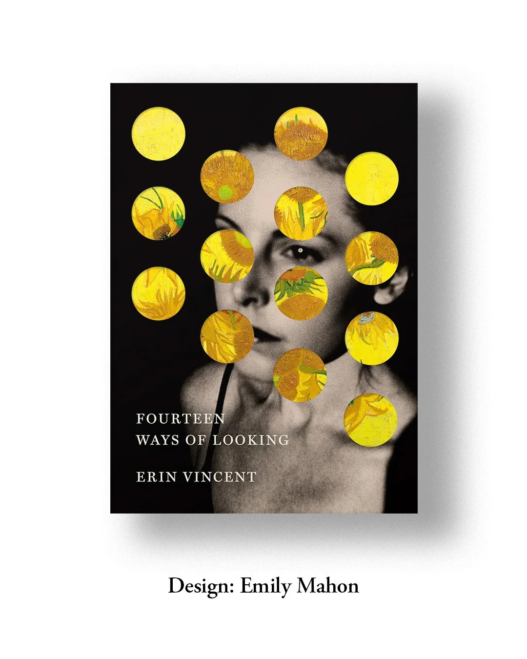
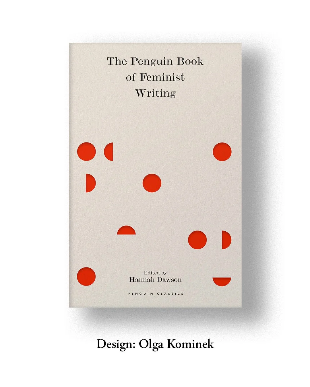
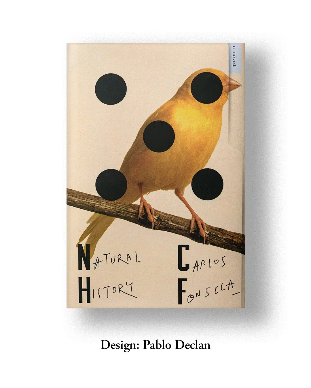
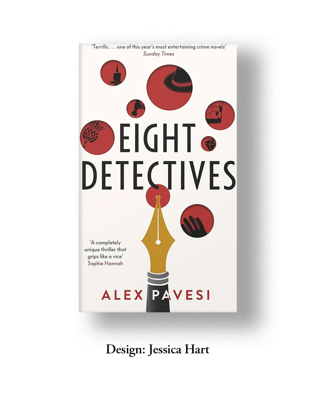
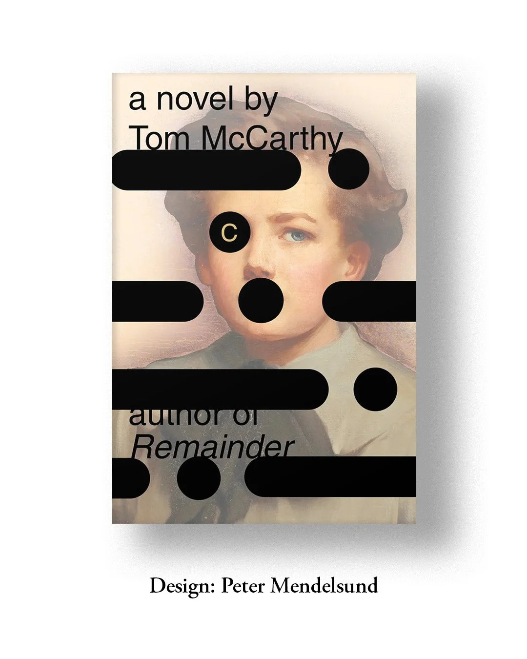
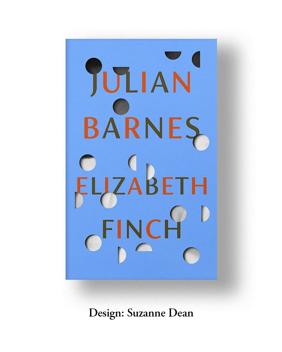
I have never been an admirer of polka dots—especially the ones in grids and symmetry. This might also have to do with my trypophobia to find them unsettling, no matter how mesmerising they might be to a much larger group in the design world. The closest I have come to appreciating the repetitive pattern is in Yayoi Kusama’s pumpkins; it really is something else. And then more recently, on book covers, like in the collection here, where its versatility is explored to my liking.
Some with contextual references and some symbolic, I love the way these dots create an apparent sense of secrecy, tease, and intrigue. I specifically enjoyed the ones with multiple flat dots and just one or two punched holes, letting you peep into the more complex world of the narrative. Along with June Park, I observe this recurring detail in Suzanne Dean’s work, with every cover adopting a combination of 2- and 3-dimensional polkas. By contrast, the covers by Pablo Declan, Henry Petrides and Kamil Rekosz use flat dots, indicating the aggressive yet supremely satisfying act of rapidly punching holes on any given sheet of paper. And if it’s printed, even better.
In the end, I do look forward to playing around with this one day in my own designs.